We’ve been designing logos and brands for years, especially Chris and his team at Studio2. Lots of really good work over the years. Designing for ourselves should be a… wait for it… cinch for us right? Yeah not quite so much. Turns out that finding just the right voice is a bit harder when it’s personal.
The Logo We Had
The previous Cinch logos were okay. Clean, simple, did the job:


Simple, lowercase typography, and uh… a submarine. Why a sub? Because it was cute, and cool, and nautical. But then a large home services company launched with a name and look close enough to ours that we started getting calls about furnace warranties. If you’re wondering where the on-site chat went (you’re not) blame the flood of questions on appliances.
If you missed the full story, we wrote about it here.
So yeah, new logo!
The Brief We Gave Ourselves
A quick reminder about Cinch: we’re a partnership between two design companies:
- Studio2 is a full-service design and branding agency out of St. Paul, Minnesota. 25 years in, award-winning work across web, print, packaging, and brand identity.
- Spigot is a web design studio out of Park City, Utah. Sharp, focused WordPress work since 2006.
Between us, we’ve designed hundreds of logos for clients. Writing our own brief took about ten minutes. Agreeing on it took considerably longer. The direction was simple:
- Approachable, but not cute
- Confident, but not corporate
- Technical, but still human
It needed to feel solid without trying too hard or doing too much.
What We Didn’t Want
No swooshes. No globes. No SUBMARINES. And definitely nothing that says “tech startup” – we are a service business run by people who are very good at WordPress, not a group of 26-year-olds disrupting the web maintenance space.
We also didn’t want anything too clever. A logo that requires explanation isn’t doing its job.
So naturally we made something with a grid icon and a floating square and spent twenty minutes asking each other if we’d broken our own rules. Nah… Looking technical is different from being a startup. Our customers are business owners who need to believe we know what we’re doing and we should look like it. We just shouldn’t look like we’re about to send them a pitch deck.
What We Landed On
Clean. Distinctive. Tech-ish. Immediately readable. It works on a website, a favicon, and well waddayahknow a t-shirt:.
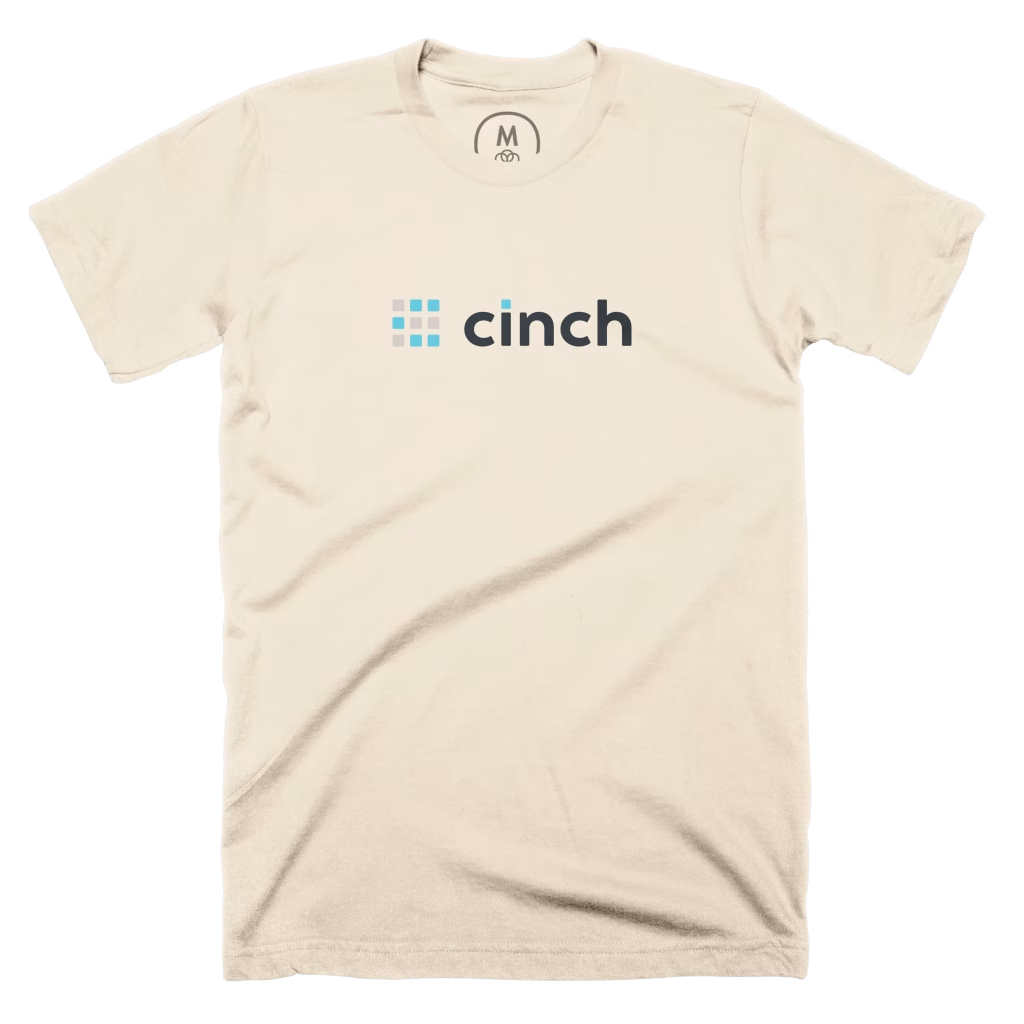
And yes of course you can order one. And a second if you prefer dark mode.
Why Any of This Matters
A rebrand forces a question: who are you, exactly?
The answer we kept coming back to is that Cinch is what happens when experienced designers decide to build something excellent on the service side too. We wanted a logo that looked like that – not flashy, not generic. And not nautical…
We’re happy with it. We’re also glad it’s done.