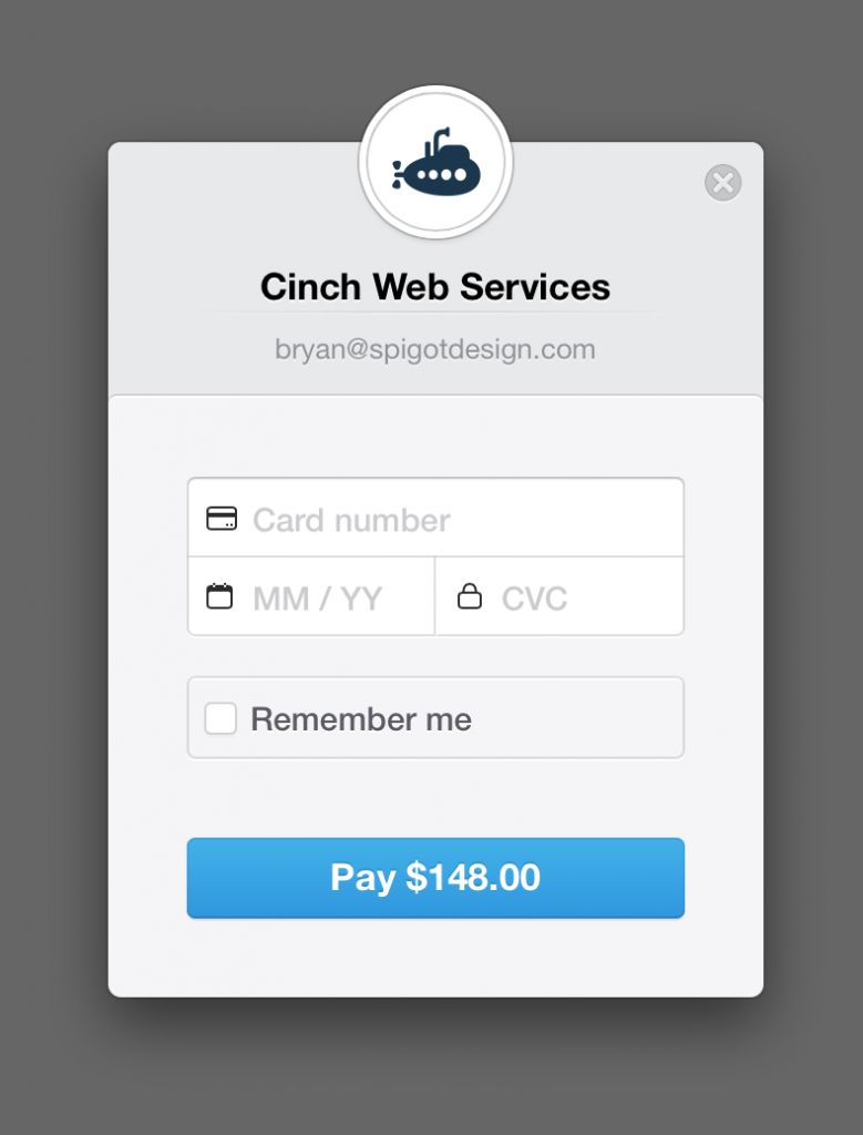
A recent change in how the Stripe Checkout flow works in WooCommerce took us by surprise when working with a customers website. As we had set up on our own site, we expected to see this modal window to check out:

We’ve liked the modal version for a couple of reasons:
- It was a secure window into Stripe’s PCI compliant system.
- It looked really nice and offered a smooth checkout process.
During the QA process on a recent project, we were surprised that the Pay Now button went away and instead we saw this, a button to Continue to Payment:

After clicking the Continue to Payment button, you’re redirected to this, an untitled page with an unstyled summary of the order and an ugly Place Order button:

Looks like poop
There were two shocking realizations here. Having to click a Continue to Payment button adds an extra click to the checkout process. I haven’t done a ton of research myself, but I’ve heard it said that fewer checkout pages lead to better conversions. Then there is the fact that the page is unhelpful in its content, and ugly to look at. Who is going to click that stripped down Place Order button?
Works like poop
Besides looking ugly, and adding the extra step to the checkout process, the notification system also gets a bit messed up. Prior to this change, an order would not go through until the payment had been made. If either the credit card failed, or the form didn’t validate, the user would have to keep trying until they succeeded.
The new workflow registers the order and sends out a New Order notification as soon as a user clicks the Proceed to Payment button. If they fail to actually pay, the order is left with a Pending Payment status. I don’t know if this is still something the development team is still working out, but it makes for a confusing admin workflow.
Okay, so what went wrong?
The WooCommerce Stripe Gateway team made a decision to change the workflow. The previous checkout flow allowed the payment window to open before the main form had been validated. So it would be possible for a user to not fill out fields like Name, Address, etc. before trying to check out. This lead to an issue where the credit card would be validated, sort of, then the user would get redirected back to the form to fill out the missing items. Check out this workflow screencapture to see how it worked.
The WooCommerce Stripe Gateway team decided that changing the workflow to the current system is the best way to mitigate this issue. And they actually recommend not using the Stripe Checkout at all. This thread is interesting enough to read, but apparently, the inline form is what Stripe itself is recommending. Here’s a quote from roykho :
The easy solution for all 4 cases is don’t use Stripe Checkout. :) The inline embedded form works just fine and is actually the newer technology going forward in addition it does Radar verification.
Check out the Stripe Elements page, where they detail UI elements for forms. I was hoping to find some info on the ‘newer technology’ that roykho alluded to, but it’s not there. The forms look nice though. If the new form also does Stripe Radar verification that is also a good thing – perhaps better than the modal version.
How to fix the ugly Stripe Checkout workflow
The options to fix the ugly checkout flow are:
- Style the Place Order summary page (Not awesome).
- Go with the recommendation and use the inline form (A bit more awesome).
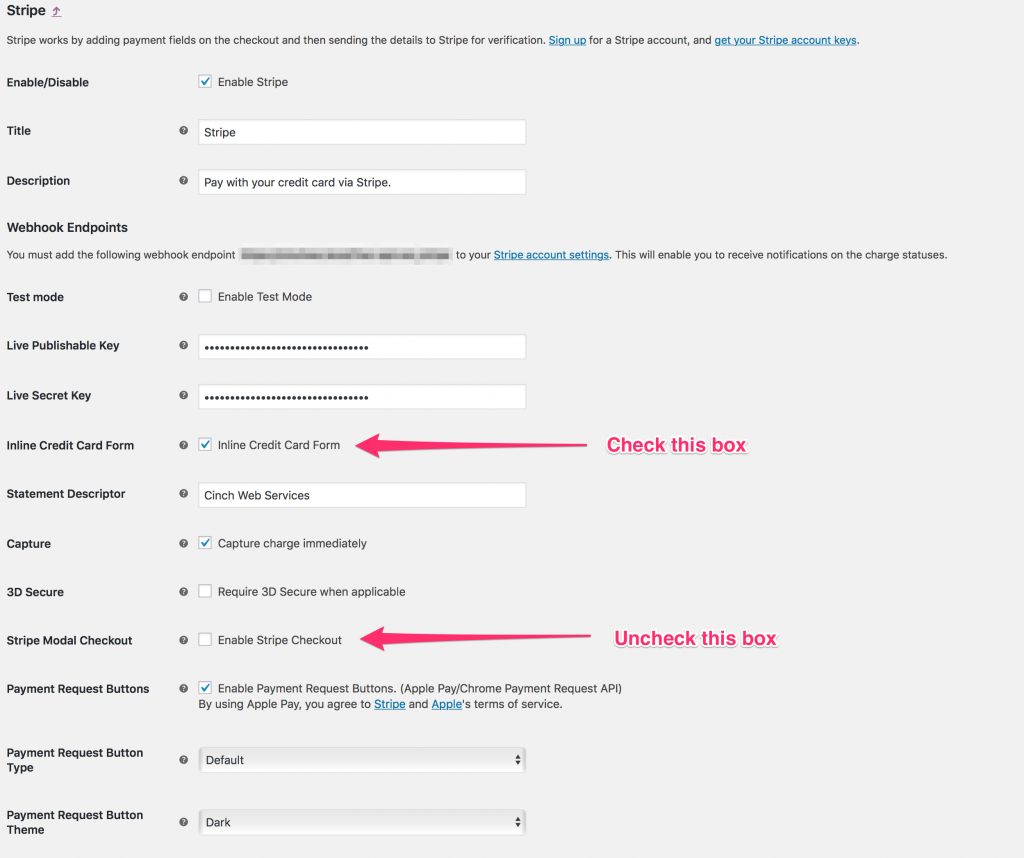
If both Stripe and WooCommerce are recommending using the inline forms, it’s not even worth discussing #1. Here’s how to switch to the inline form:
- Log into WordPress. Go to WooCommerce › Settings › Payments › Stripe
- Check Inline Credit Card Form. (Optional, see below)
- Uncheck Enable Stripe Checkout
- Test the checkout

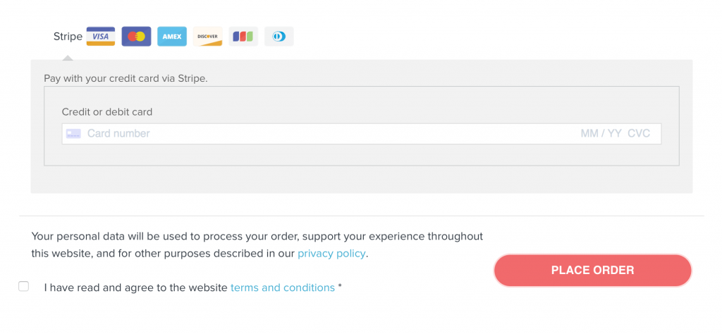
This will give you this minimal, single line form on the checkout page:

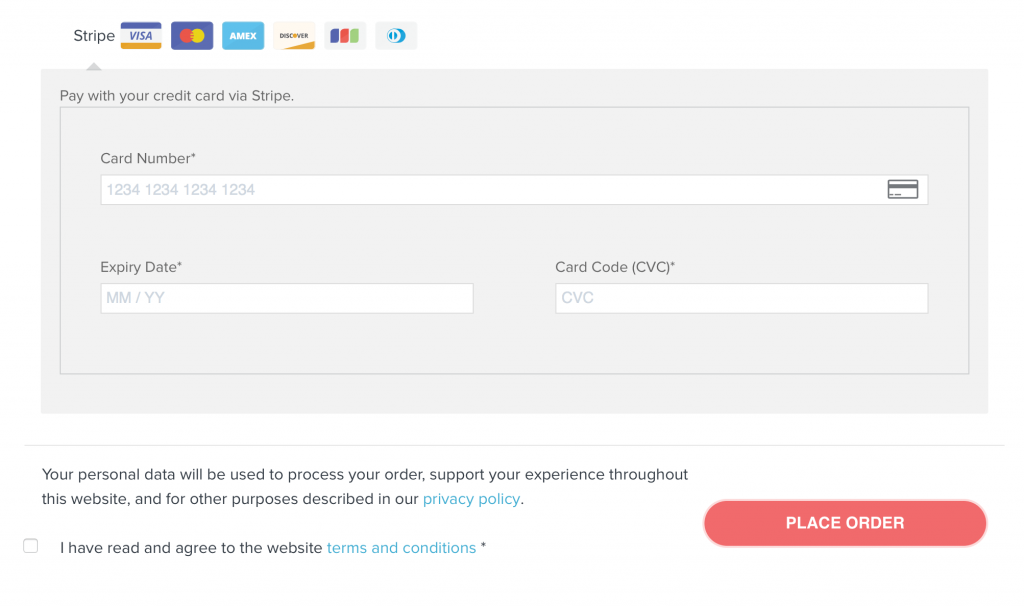
Alternatively, you can leave the Inline Credit Card Form unchecked (and also keep Enable Stripe Checkout unchecked) and you’ll get a three field form like this:

I don’t have the metrics on why you’d use one over the other. I’m also going to assume that both are equally secure and you can choose based on aesthetics.
Moving Forward
While we were disappointed that the Stripe Checkout wouldn’t work as it has before, it is a good chance to take a look at our checkout flow. If the way forward is to use the inline forms then so be it.
Our entire Cart and Checkout pages are basically the out of box experience that WooCommerce provides. Even as I research and write this, our Checkout pages are ugly and hard to read. Go put a subscription in the cart and see for yourself ;) Don’t forget to check out too ;) ;) ;)
Over the next few weeks (or months) I’ll be rethinking our checkout flow. Check back to see how that goes.
Was this helpful?
Let me know in the comments if this was helpful. If you have questions you can certainly leave a comment, or better yet – start a chat and we’ll see how we can assist.
2 Comments
Thanks for this write up. It was really helpful after discovering the Stripe Checkout modal wasn’t working as it was earlier in the year. The new flow for it is terrible, though I understand the validation rationale.
We’ve basically switched over to the inline form. It’s not quite as splashy, but it gets the job done in a clean manner.