Since we’ve had a hard time fininshing our About page and our Story, it’s likely you may not know that Cinch is a partnership between two design companies – Studio2 and Spigot. So we take design as seriously as we take fixing websites. That includes the Cinch logo. Simple, clean, effective. We were pretty happy with it, actually:
But then something funny started happening. Well, funny to us. Less funny to the confused customers who started reaching out to us.
Mistaken Identity
Not that the word ‘cinch’ is all that uncommon, but there is this other company going by Cinch Home Services. Big corporate. And their logo looks suspiciously familiar. Like, really familiar. Like, “hey, didn’t we design something exactly like that years ago?” familiar:
Sorry, wrong Cinch!” became our unofficial company motto.
Mistaken No More
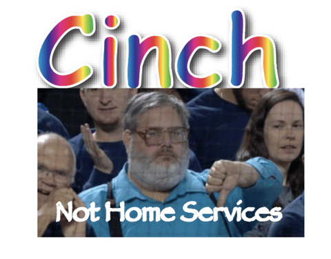
Welcome to the new Cinch logo, a synergistically optimized, paradigm-shifting, blockchain-adjacent visual manifestation that leverages cutting-edge chromatic disruption technologies and enterprise-grade typographic solutions to deliver maximum brand authenticity through revolutionary anti-design methodologies in the post-digital marketplace ecosystem:

Merch included
To drive home the point we’ve made a set of new-brand merch including this beauty:

Our new company motto: “Not Home Services”
The Real Story
After years of redirecting not-our-customers to the other Cinch, it’s definitely time for a rebrand. Rather than getting upset or hiring lawyers we can’t afford, we’re going to change what we can: ourselves. And thanfully, that Comic Sans monstrosity isn’t it. We’re currently going through the early phases of a redesign, and it’s been a fun process. We’re leaning into a bit of our history and are excited to unleash Cinch v4 onto the world. I doubt it will stem the tide of HVAC subscription cancelations, but here’s a sneak peek:

Bwaa-ha-ha-ha-haaaaaaaa!